环绕旋转
html
text
1
2
3
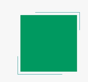
<body>
  <div class='bb'></div>
</body>
css
text
1
2
3
4
5
6
7
8
9
10
11
12
13
14
15
16
17
18
19
20
21
22
23
24
25
26
27
28
29
30
31
32
33
34
35
36
37
38
39
40
41
42
43
44
 .bb, .bb::before, .bb::after {
         position: absolute;
         top: 0;
         bottom: 0;
         left: 0;
         right: 0;
      }

       .bb {
         width: 200px;
         height: 200px;
         margin: auto;
         background: #009a61;
         color: #009a96;

      }

       .bb::before, .bb::after {
         content: '';
         z-index: -1;
         margin: -5%;
         box-shadow: inset 0 0 0 2px;
         animation: clipMe 8s linear infinite;
         transition:clip 0.3s;
      }

       .bb::before {
         animation-delay: -4s;
      }

      @-webkit-keyframes clipMe {
         0%, 100% {
            clip: rect(0px, 220px, 2px, 0px);
         }
         25% {
            clip: rect(0px, 2px, 220px, 0px);
         }
         50% {
            clip: rect(218px, 220px, 220px, 0px);
         }
         75% {
            clip: rect(0px, 220px, 220px, 218px);
         }
      }