实现原理:
div的before元素当成左边框
内部一个class=bottom的i标签当下边框
div的after元素当成右边框
内部一个class=top的i标签当上边框
效果图: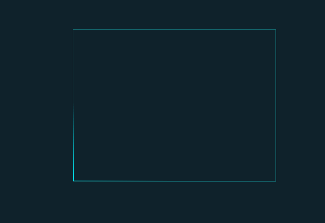
原理图: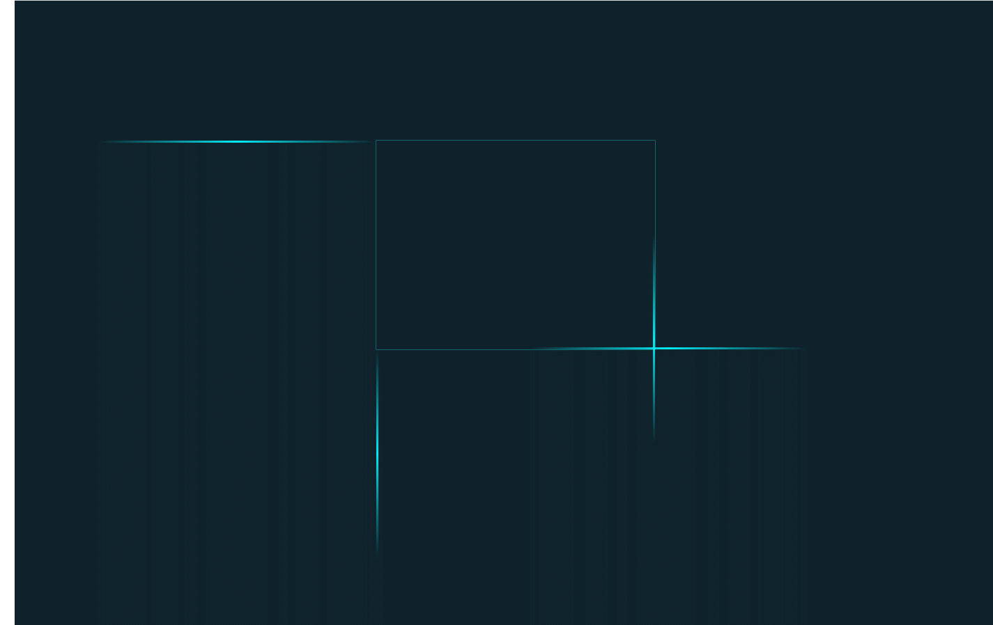
左边框: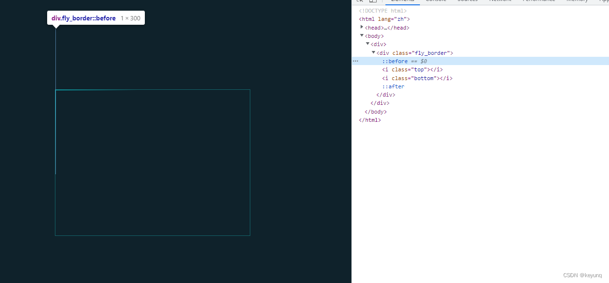
text
1
2
3
4
5
6
7
8
9
10
11
12
13
14
15
16
17
18
19
20
21
22
23
24
25
26
27
28
29
30
31
32
33
34
35
36
37
38
39
40
41
42
43
44
45
46
47
48
49
50
51
52
53
54
55
56
57
58
59
60
61
62
63
64
65
66
67
68
69
70
71
72
73
74
75
76
77
78
79
80
81
82
83
84
85
86
87
88
89
90
91
92
93
94
95
96
97
98
99
100
101
102
103
104
105
106
107
108
109
110
111
112
113
114
115
116
117
118
119
120
121
122
123
124
125
126
127
128
129
130
131
132
133
134
135
136
137
138
139
140
141
142
143
144
145
146
147
148
149
150
151
<!DOCTYPE html>

<html lang="zh">

<head>

    <meta charset="UTF-8">

    <meta http-equiv="X-UA-Compatible" content="IE=edge,chrome=1">

    <meta name="viewport" content="width=device-width, initial-scale=1.0">

    <title>纯CSS3流光边框特效</title>

    <style>
        .fly_border {

            border: 1px solid rgba(32, 254, 255, 0.3);
            /* 宽高和相对定位是一定要给的,因为这会影响.animate-border子元素的定位 */
            position: relative;
            width: 400px;
            height: 300px;
            overflow: hidden;
            margin: 200px auto;
        }

        .fly_border::before {
            content: " ";
            position: absolute;
            width: 1px;
            height: 100%;
            top: -100%;
           left: 0;
            background-image: linear-gradient(
   0deg,
   transparent,
   #03e9f4,
   transparent
            );
            animation: two 4s linear infinite;
        }

        .fly_border::after {
            content: " ";
            position: absolute;
            width: 1px;
            height: 100%;
            bottom: -100%;
           right: 0;
            background-image: linear-gradient(
   360deg,
   transparent,
   #03e9f4,
   transparent
            );
            animation: four 4s linear 2s infinite;
        }

        .fly_border i {
            position: absolute;
            display: inline-block;
            height: 1px;
            width: 100%;
        }

        .fly_border .bottom {
            bottom: 0;
           left: -100%;
            background-image: linear-gradient(
   270deg,
   transparent,
   #03e9f4,
   transparent
            );
            animation: one 4s linear 1s infinite;
        }

        .fly_border .top {
            top: 0;
           right: -100%;
            background-image: linear-gradient(
   270deg,
   transparent,
   #03e9f4,
   transparent
            );
            animation: three 4s linear 3s infinite;
        }

        body {
            height: 100%;
            background-color: #0f222b;
        }


        @keyframes one {
            0% {
   left: -100%;
            }
            50%,
            100% {
   left: 100%;
            }
        }

        @keyframes two {
            0% {
   top: -100%;
            }
            50%,
            100% {
   top: 100%;
            }
        }

        @keyframes three {
            0% {
   right: -100%;
            }
            50%,
            100% {
   right: 100%;
            }
        }

        @keyframes four {
            0% {
   bottom: -100%;
            }
            50%,
            100% {
   bottom: 100%;
            }
        }

        </style>

</head>

<body>

    <div>

        <div class="fly_border"><i class="top"></i><i class="bottom"></i></div>

    </div>

</body>

</html>
参考资料:
青青子衿~~ vue 实现边框流光动画