引言
最近学完css3的知识,下面做了几个有趣案例,来帮助自己熟悉css3的知识。
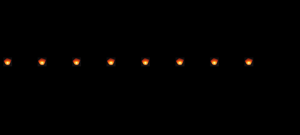
一、升空的孔明灯
text
1
2
3
4
5
6
7
8
9
10
11
12
13
14
15
16
17
18
19
20
21
22
23
24
25
26
27
28
29
30
31
32
33
34
35
36
37
38
39
40
41
42
43
44
45
46
47
48
49
50
51
52
53
54
55
56
57
58
59
60
61
62
63
64
65
66
67
68
69
70
71
72
73
74
75
76
77
78
79
<!DOCTYPE html>
<html>
<head>
<meta charset="utf-8">
<title>孔明灯</title>
<style>
*{
padding: 0;
margin: 0;
}
html{
height: 100%;
background-color: #000;
}
div{
height: 100%;
width: 100%;
position: relative;
}
@keyframes run{
0%{
top: 600px;
}
100%{
top: 100px;
width: 10px;
height: 10px;;
}
}
div>img{
width: 100px;
height: 100px;
display: inline-block;
position: absolute;
top: 800px;
animation: run 10s infinite;
}
div>img:nth-child(1){
left: 10px;
}
div>img:nth-child(2){
left: 120px;
}
div>img:nth-child(3){
left: 230px;
}
div>img:nth-child(4){
left: 340px;
}
div>img:nth-child(5){
left: 450px;
}
div>img:nth-child(6){
left: 560px;
}
div>img:nth-child(7){
left: 670px;
}
div>img:nth-child(8){
left: 780px;
}
</style>
</head>
<body>
<div>


</div>
</body>
</html>
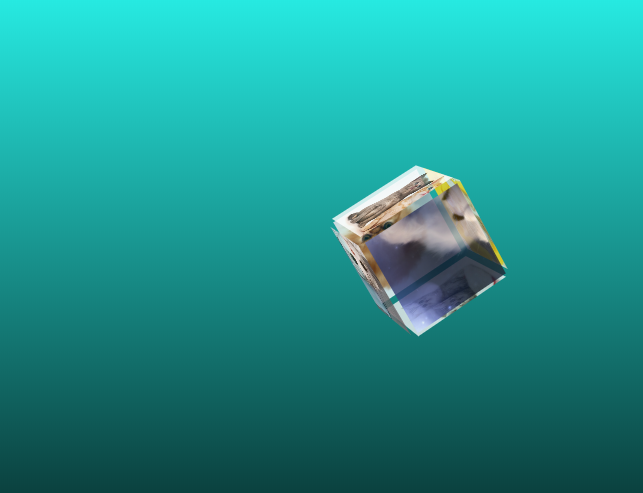
二、旋转盒子
text
1
2
3
4
5
6
7
8
9
10
11
12
13
14
15
16
17
18
19
20
21
22
23
24
25
26
27
28
29
30
31
32
33
34
35
36
37
38
39
40
41
42
43
44
45
46
47
48
49
50
51
52
53
54
55
56
57
58
59
60
61
62
63
64
65
66
67
68
69
70
71
72
73
74
75
76
77
78
79
80
81
82
83
84
85
86
87
88
89
90
91
92
93
94
95
96
97
98
99
100
101
102
103
104
105
106
107
108
109
110
111
112
113
114
115
116
117
118
119
120
121
122
123
124
125
126
127
128
129
130
131
132
133
134
135
136
137
138
139
140
141
142
143
<!DOCTYPE html>
<html lang="en">
<head>
   <meta charset="UTF-8">
   <meta name="viewport" content="width=device-width, initial-scale=1.0">
   <meta http-equiv="X-UA-Compatible" content="ie=edge">
   <title>Document</title>
   <style>
      *{
            padding: 0;
            margin: 0;
        }
        html{
            height: 100%;
            background-image: linear-gradient(#29f9f0 0% , #000 80%);
        }
      @keyframes run{
            0%{
            transform: rotateX(0deg) rotateY(0deg) rotate(0deg);
            }
            100%{
            transform: rotateX(720deg) rotateY(360deg) rotate(360deg);
            }
        }
        .wapper{
            width: 300px;
            margin-top: 100px;
            perspective: 800px;
            margin: 50px auto;
        }
      .wapper .cube{
            width: 300px;
            height: 300px;
       transform-style: preserve-3d;
       position: relative;
       transform: rotateX(-50deg) rotateY(-50deg) rotate(-50deg);
       animation: run 10s infinite;
        }
        .wapper .cube span{
            transition: all 1s cubic-bezier(0.9,-0.2,1,1);
        }
        .cube>span{
            display: block;
            width: 90px;
            height: 90px;
            position: absolute;
            left: 50px;
            top: 50px;
            opacity: 0.8;
            background-color: rgba(0,100,120,1);

        }

        .cube span.num_front{
          transform: translateZ(50px);
          background-image: url(img/front.jpg);
          background-size: cover;
      }
      .cube span.num_back{
          transform: translateZ(-50px);
          background-image: url(img/back.jpg);
          background-size: cover;
      }
      .cube span.num_left{
          transform: translateX(-50px) rotateY(90deg);
          background-image: url(img/left.jpg);
          background-size: cover;
      }
      .cube span.num_right{
          transform: translateX(50px) rotateY(-90deg);
          background-image: url(img/right.jpg);
          background-size: cover;
      }
      .cube span.num_top{
          transform: translateY(-50px) rotateX(90deg);
          background-image: url(img/top.jpg);
          background-size: cover;
      }
      .cube span.num_bottom{
          transform: translateY(50px) rotateX(-90deg);
          background-image: url(img/bottom.jpg);
          background-size: cover;
      }

      .wapper .cube:hover .num_front{

          transform: translateZ(100px) scale(1.5);
      }
      .wapper .cube:hover .num_back{

          transform: translateZ(-100px) scale(1.5);
      }
      .wapper .cube:hover .num_left{

          transform: translateX(-100px) rotateY(90deg) scale(1.5);
      }
      .wapper .cube:hover .num_right{

          transform: translateX(100px) rotateY(-90deg) scale(1.5);
      }
      .wapper .cube:hover .num_top{

          transform: translateY(-100px) rotateX(90deg) scale(1.5);
      }
      .wapper .cube:hover .num_bottom{

          transform: translateY(100px) rotateX(-90deg) scale(1.5);
      }

   </style>
</head>
<body>
   <div class="wapper">
        <div class="cube">
   <!-- 正面 -->
      <span class="num_front">


      <!-- 反面 -->
      <span class="num_back">


      <!-- 左面 -->
      <span class="num_left">


       <!-- 右面 -->
      <span class="num_right">


       <!-- 上面 -->
      <span class="num_top">


       <!-- 下面 -->
      <span class="num_bottom">


        </div>
    </div>
</body>
</html>